
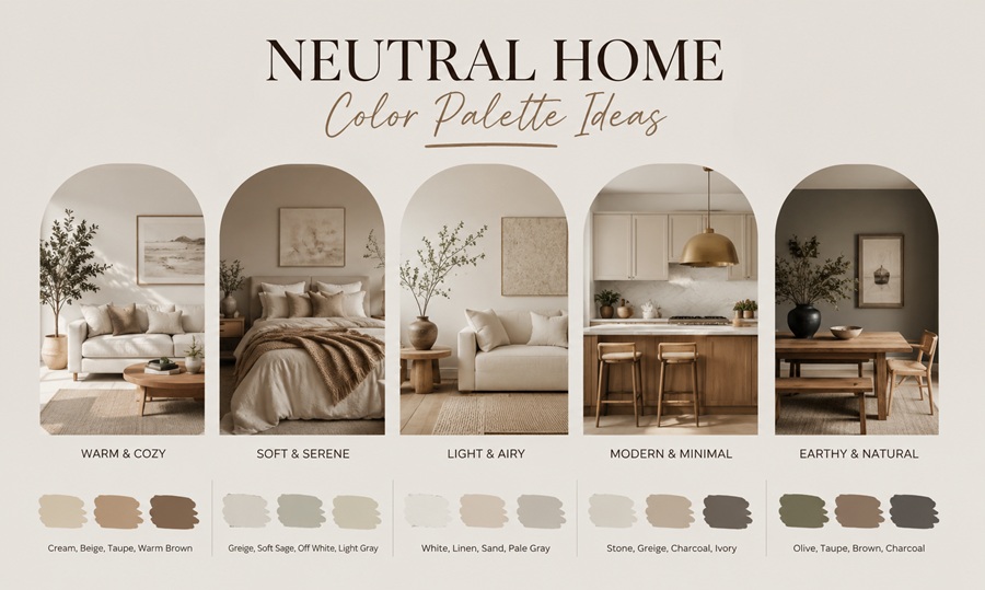

A neutral home color palette pairs warm or cool base tones — like greige, warm white, taupe, or soft charcoal — with two or three supporting shades in the same undertone family. The key to a palette that doesn’t feel flat is contrast in value, not color: pairing a light wall with a mid-tone trim and a deeper accent keeps neutral rooms from looking washed out.
Neutral doesn’t have to mean boring, and it doesn’t have to mean beige. The myth that neutral palettes lack personality usually comes from seeing them done without enough contrast or texture, not from the colors themselves.
A neutral palette gives a home flexibility — furniture, artwork, and seasonal decor can change over time without clashing with the walls, which is one reason neutral schemes remain the most requested choice among homeowners preparing to sell as well as those settling in for the long term.
Myth: Neutral Colors Are Boring
The idea that neutral palettes are flat or personality-free is one of the most common misconceptions in home design. In reality, a well-built neutral scheme relies on layering: different undertones, varied textures, and contrast in value do the work that bright colors would otherwise do.
A room painted entirely in one flat beige, with no variation in trim, furniture tone, or texture, will feel dull — but that’s a failure of execution, not a limitation of neutral color itself.
The other source of this myth is outdated neutral trends. The yellow-heavy beiges popular in the 1990s and early 2000s gave the whole neutral category a reputation it hasn’t fully shaken, even though current neutral palettes lean cooler, grayer, or more tonally balanced than those earlier shades.
Reality: Warm vs. Cool Neutrals Behave Very Differently
Warm neutrals — think greige, warm white, taupe, and soft tan — carry yellow, red, or brown undertones. They tend to feel cozy and pair well with wood tones, brass hardware, and earthy accents. Cool neutrals, including true gray, cool white, and soft charcoal, carry blue or green undertones and tend to feel crisper, pairing well with black or chrome hardware and cooler accent colors like navy or sage.
Mixing warm and cool neutrals in the same room without a transitional color often creates a muddy or mismatched look, which is one of the most common neutral-palette mistakes. Sticking to one undertone family throughout a room, or a connected open floor plan, keeps everything feeling cohesive.
Lighting also changes how a neutral reads throughout the day. North-facing rooms tend to receive cooler, bluer light, which can make a warm neutral look slightly gray by midday, while south-facing rooms flood in warmer light that can push a cool neutral toward beige. This is why the same paint color can look completely different in two rooms of the same house, and why testing on the actual wall matters more than trusting a paint chip alone.
What Is a Greige Paint Color?
Greige is a blended gray-beige that sits between warm and cool neutrals, which is why it’s become one of the most popular whole-home colors in the past decade. It reads warm in some lighting and cool in others, making it a flexible base for rooms with different light exposures.
This flexibility is exactly why greige has stayed popular even as broader color trends shift — it doesn’t commit as strongly to either the warm or cool camp, so it tends to age better than paint colors with a more pronounced undertone in either direction.
Should Every Room Be the Same Neutral Color?
Not necessarily. Using one wall color throughout an open floor plan creates flow, but bedrooms and bathrooms can shift slightly warmer or cooler within the same undertone family for variety, as long as the transition between spaces feels intentional rather than abrupt.
Practical Palette Pairings by Room
For a living room, pair a warm greige wall with white trim, a mid-tone wood coffee table, and one deep accent like charcoal or forest green on a single piece of furniture or artwork. This gives the eye enough contrast to stay interesting.
In a kitchen, warm white cabinets paired with a taupe or soft gray island, brass or matte black hardware, and a stone countertop with subtle veining creates depth without introducing bold color.
In a bedroom, a soft warm white or pale greige wall paired with linen bedding, walnut or oak furniture, and one textured accent — a woven rug or a knit throw — builds a calm, layered look.
In a bathroom, cool gray or greige tile pairs well with matte black fixtures and white countertops, while a warmer palette works better with brass fixtures and wood vanity tones.
In a home office, a slightly deeper neutral — like a warm taupe or soft charcoal — on one accent wall can reduce eye strain from screen glare while still keeping the room feeling calm and cohesive with the rest of the home. Pair it with lighter neutral trim to keep the room from feeling too enclosed.
How to Test Neutral Paint Colors Before Committing
Paint large swatches — at least two feet by two feet — directly on the wall in multiple spots, since lighting changes throughout the day and across different walls in the same room. Observe the swatch in morning, midday, and evening light before deciding.
Hold the swatch next to existing fixed elements like flooring, countertops, or trim that won’t be changing, since undertones can clash even when two colors look similar on their own.
It also helps to view the swatch alongside a sample of any large furniture pieces you’re keeping, such as a sofa or rug, since a neutral wall color that clashes with a fixed furniture undertone is one of the more common regrets homeowners report after repainting.
Frequently Asked Questions
What’s the most popular neutral paint color right now?
Warm greiges and soft warm whites remain the most requested whole-home colors, largely because they read differently depending on lighting and pair well with both wood and metal finishes.
How do I know if my neutral is warm or cool?
Compare it against a pure white sheet of paper in natural light — if it leans yellow, pink, or brown, it’s warm; if it leans blue or green, it’s cool.
Can I mix warm and cool neutrals in one house?
Yes, but it typically works best when different rooms are separated by doors or hallways rather than existing in the same open sightline.